Purpose & Vision
Phoenix Telecom required a refreshed brand identity that communicated innovation, reliability, and forward momentum within a highly competitive telecommunications landscape. The objective was to design a cohesive visual system that felt modern and energetic while remaining professional and trustworthy—capable of scaling across print, digital, and corporate environments.
The brand needed to signal transformation and growth without leaning into generic tech aesthetics, establishing a distinct presence that could evolve alongside the company.
Challenge
The primary challenge was balancing technical credibility with visual distinction. Telecommunications brands often default to cold, utilitarian design systems, making it difficult to stand out while maintaining authority. Phoenix Telecom needed a brand identity that felt progressive and human—confident without being aggressive, and bold without sacrificing clarity.
Additionally, the system needed to translate seamlessly across physical stationery, executive communications, and digital interfaces.
Strategy
The strategy focused on symbolism, clarity, and cohesion.
The phoenix concept became the foundation—representing renewal, resilience, and upward momentum. Rather than using literal imagery, the brand mark was refined into an abstract, fluid form that conveyed motion and adaptability. A vibrant yet controlled color palette was introduced to evoke energy and innovation, balanced with clean typography to maintain professionalism.
Every element of the system was designed to work together as a unified visual language—flexible enough for future growth while consistent enough to build strong brand recognition.


Creative Direction & Execution
Visual Identity
Designed a modern, abstract logo symbol inspired by motion and renewal
Developed a bold, energetic color palette anchored by gradient depth
Established clean, legible typography to balance vibrancy with clarity
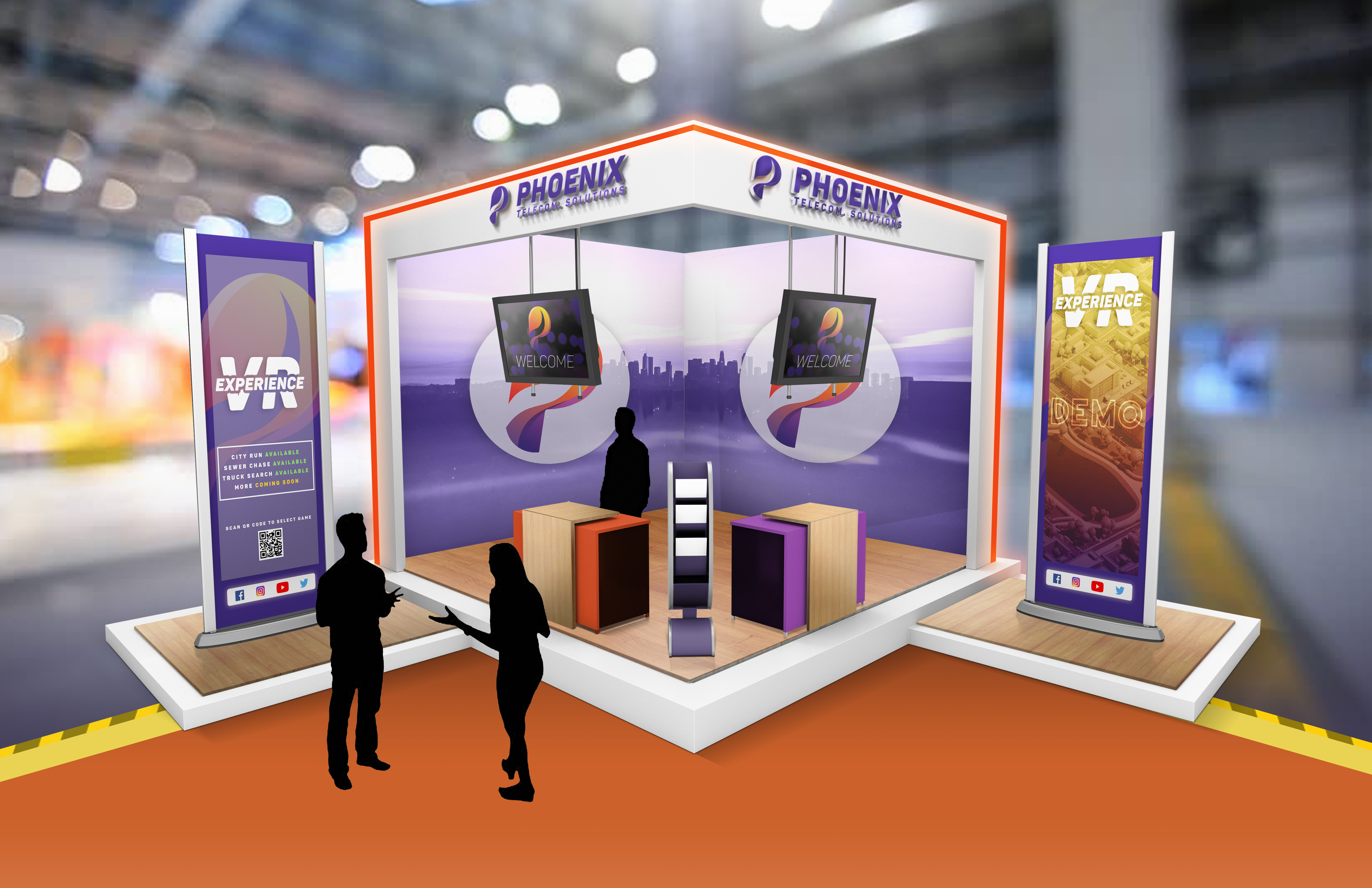
Brand Collateral
Designed a complete stationery system including business cards, letterheads, envelopes, and stamps
Ensured consistent application of brand elements across all physical touchpoints
Created layouts that felt intentional, refined, and executive-ready
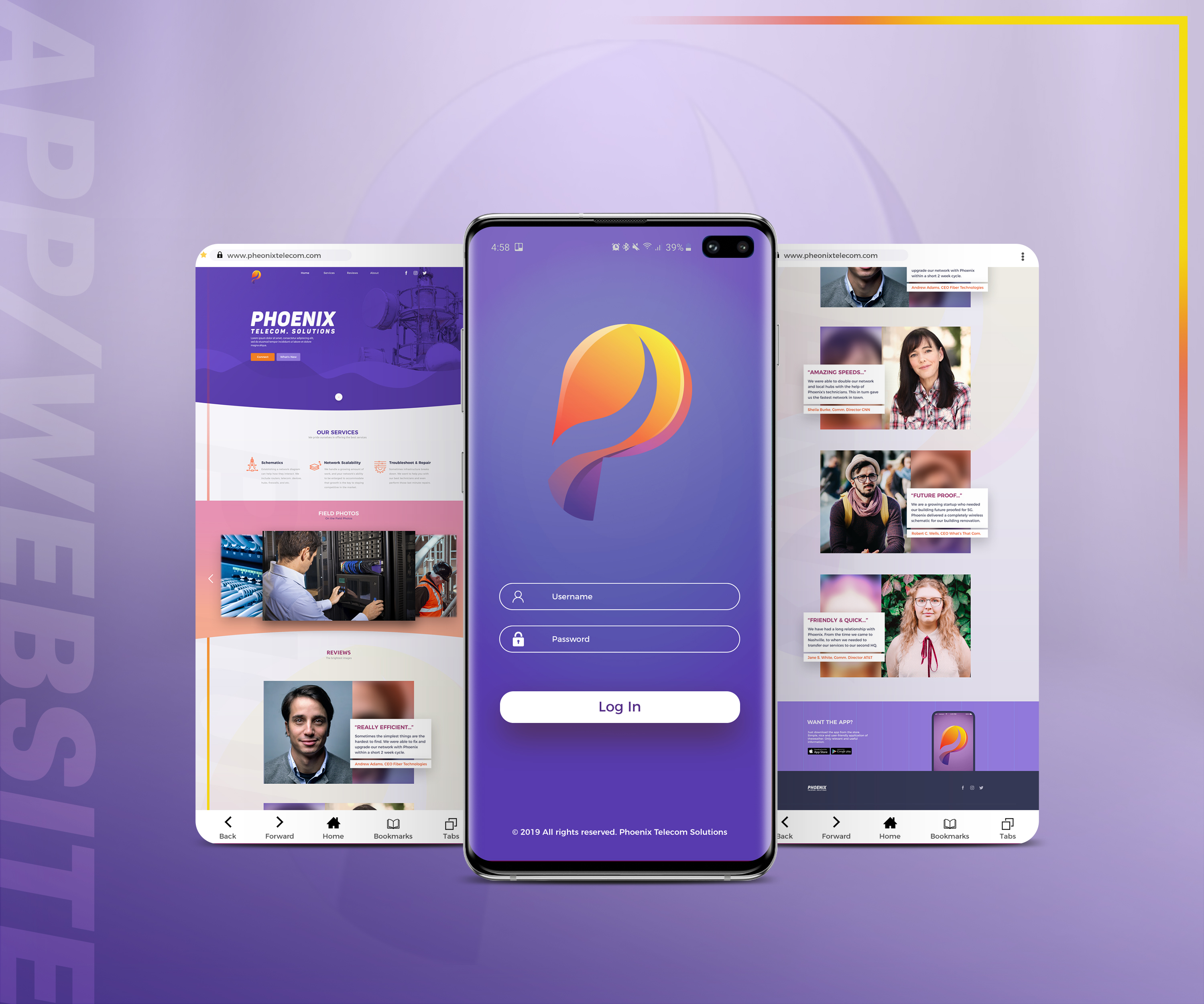
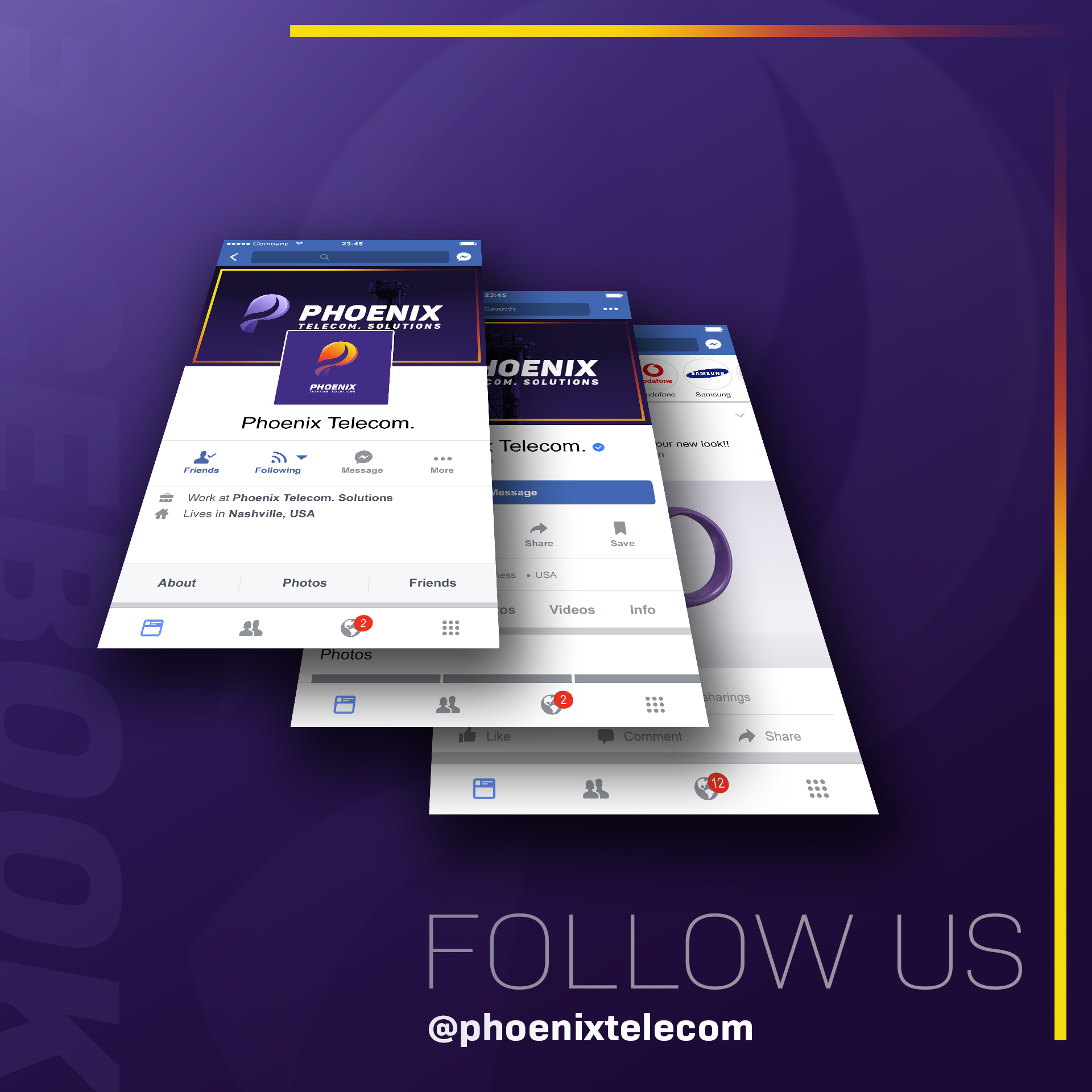
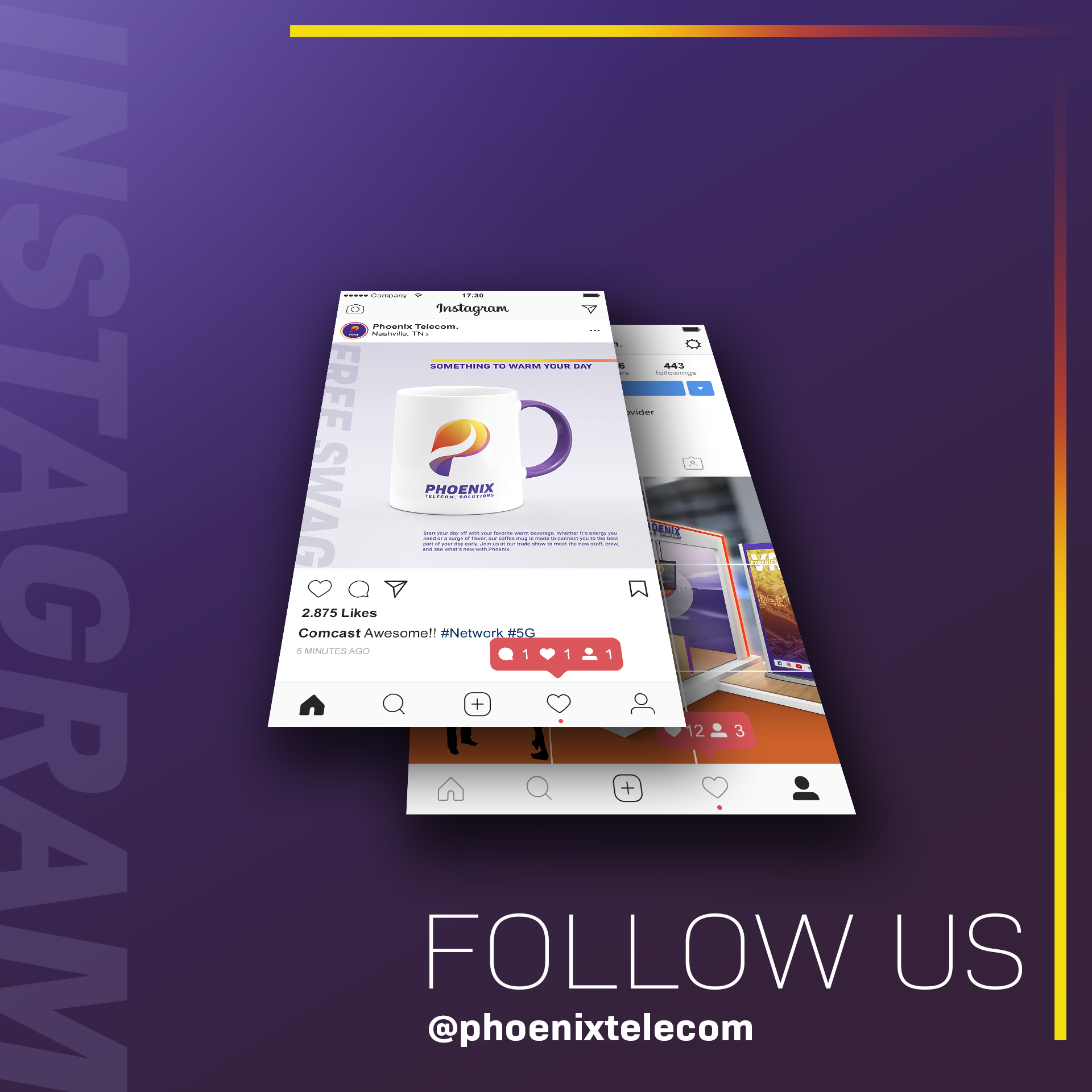
Digital Touchpoints
Extended the brand into digital environments through mobile and screen-based applications
Maintained visual consistency across physical and digital assets
Designed assets with scalability and adaptability in mind
Results / Impact
The final identity positioned Phoenix Telecom as a forward-thinking, resilient, and modern organization. The cohesive visual system strengthened brand recognition while providing a flexible foundation for future expansion across platforms and mediums.
The brand now communicates confidence, innovation, and momentum—reflecting Phoenix Telecom’s mission and long-term vision.
Closing Reflection
This project exemplifies my approach as a visual architect—building systems, not just visuals. By grounding design decisions in strategy and symbolism, the Phoenix Telecom identity moves beyond aesthetics to become a scalable, enduring brand platform.